(Minor language warning.)
A lot of you may have heard me rant against 'modern colouring'. I'm writing this to try to explain - thoughtfully, I hope - my problem with it.
First, I want to define the term. When I refer to 'modern colouring', I don't mean the 'bling' (as I call it) - the special effects, the depth of shading and highlighting that only became available in the days of Photoshop and computer tech.
There are issues with the bling in that affect my problem, so I'll briefly cover it, but the bling isn't my problem. I like the bling.
My problem is with the palette; the choice of colours.
Simply, I find it too dark and too dreary.
No vibrancy or life, and almost always washed out - try to find more than one colour per page in a recent comic. Two, if they're pushing it. Try to find something that isn't in the hazy, 'olive' end of the hue.
Beautifully rendered colours, but so dreary.
Is that supposed to be a forest?
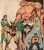
That's the Crimson Commando, btw:
I can't tell the difference in those reds…
In a time when comics take themselves far too seriously, it seems like there's a ban on bright colours; as if bright colours can't be taken seriously, and therefore can't be popular.
In fact, good luck finding anything that isn't basically orange. So many comics these days just feel so orange.
Orange is dry. Orange is dull.
It gives a post-Apocalyptic feel to the comics. Has an Apocalypse happened to the Marvel and DC universes, and we weren't told about it?
I don't see it nearly as much orange / earth tones in real life as in comics - in these days when realism is the buzzword. By the way, I live in Australia!
 If you can't get that much orange here, where can you get it?
I got into comics in the late 80s, when comics generally followed a bright but realistic palette. It's what I grew used to. Now, instead of this inviting, bright, vibrant world, it's all this dull, dreary, depressing post-Apocalypse. Always orange, always dull.
Original vs. New & improved
The depth and detail of the colours in the second are far better rendered; but the colours themselves are duller and more washed out. Note the lack of white.
(This is far from the worst example, but one of the few where I've got new and old versions of the same image.)
Cognitive Dissonance and the Uncanny Valley
Tom Hanks: real, cartoon, CG
That's why you can look at, say, C3P0 and not be completely put off; or you can look at a human being and not be put off… but those almost-human Japanese robots? <shudder>
That's where the bling causes problems. It looks just realistic enough that your mind tells you to expect realism in the colours; but you don't get it, so it tells you you're constantly looking through a filter. Something's wrong with the light!
This is the kind of thing I'm talking about. This is supposed to be Persuasion; but instead of a purple-skinned girl, my mind has always told me this is a normal girl under very purple light. Since long before I began articulating this kind of thing, I've thought the solution would be, simply, to put another character next to her, with lighter (real) skin tones.
The bling also tends to cover up the drawings; but it's one kind of art vs. another.
Whether that's a problem or not is entirely subjective. Even more than everything else in this essay.
Your face is subjective!
Yeah. Thanks for that.
One thing I always appreciate in my escapism is a world that I want to visit. A wondrous place that I like to spend time in - a lot of time. Month after month.
This new, dull world, that Marvel and DC give me is not that.
The problem there is, it's alienating. It happens on a subliminal level, but I just don't feel like I want to be part of the world I'm seeing. My emotions rebel, and bury themselves, and I'm not 'in' the comic… Just reading it, detached, like a detached guy.
It's like living in this kind of gloom all the time.
(This is Google Streetview of Wilson, North Carolina, near Vicks Elementary School.)
I’d rather live here.
… Wait a second, I do live here! How did they find my house?
These dreary-coloured worlds washed out in orange are not places I want to spend a lot of time in.
But all the video games are washed out in orange.
If All Your Friends Were Named Cliff, Would You Jump Off Them?
In the second, I’m not all that into games. Sorry. Citing them as an example won’t help.
You love movies, and they do the same thing!
True, I do. But not for that, and I’m not fond of the new black-and-white age of movies.
NB: X-Men seem to be an exception; they often are a cold steel blue. It's no better than the orange.
You want a good way to do thematic colours? Try this movie:
 A mildly successful film
This move was colour-coded; but not by timing the colours until it was effectively monochrome; they just made sure most of the colours they shot at any given 'location' were similar; the forest moon of Endor was greens, Tatooine was oranges and earth tones; Imperial areas were cold greys and blues. All the Star Wars movies pulled this off, but the last did it most obviously - and still well. Real life does that; most areas will be, basically, one colour - but not at the cost of all others.
For me, movies like Batman Forever and Superman Returns were unsuccessful as follow-ups in part because their colour schemes were so different to the originals (but note: that's only part of the reason).
Yes, yes, you're one of those people who hates orange and teal.
I've got nothing against those colours.
Sure you do. Teal is basically blue, and nothing frightens you more than the colour blue.
Uh... true. But that has nothing to do with movies!
It's because of a movie!
Okay, wise guy, it's got nothing to do with why I hate that movies are so overdependent on those colours!
It's artistic!
Did you just accuse Michael Bay of art?
And when everybody is doing exactly the same thing, it ain't art.
It's realistic. Look out your window... Those colours exist in the real world.
Look out my window? Okay. I'll do that. I do see orange. I don't see teal, but the sky is a sort of bruised blue colour.
You know what else I see? That I don't see in comics and movies anymore?
Other colours.
I see trees of green. Red roses, too. The colours of the rainbow, all pretty in the sky, are also on the faces of the people passing by.
You don't see all that.
Okay, Louis Armstrong I ain't... but the dominant colour I see right now is green. It often is. The outside isn't washed out in an orange-and-teal wasteland.
This:
could never recapture the spirit of this:
Further, every single jet has only red lighting:
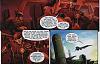 Who designed this thing, Cyclops?
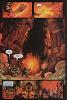
And monitor rooms have none at all:
All that high-tech equipment, and you can't afford a light bulb?
Continued in part 2...


 Reply With Quote