


And FloYo is my girlfriend. She also did the bulk of the work on that Puck and Hawkeye page I posted earlier.

And FloYo is my girlfriend. She also did the bulk of the work on that Puck and Hawkeye page I posted earlier.
Double nice!
Support Artists, Not Companies! Creator-owned comics are where the real art is at!
My new website! http://lifelessordinarywebnovel.com/home.html Follow my super-powered web-novel adventures, "Life Less Ordinary"!
Twitter (1) = @RealWyldeChild
Twitter (2) = @lifewebnovel
FaceBook = https://www.facebook.com/realwylde.child or search for me at " Life Less-Ordinary "
Also 'occasionally' ranting Alpha Flight related stuff at http://canadas-own-the-flight.blogspot.com/


That is a great drawing, FloYo. She looks like she'd fit into Byrne's Alpha Flight quite well.
~ Le Messor
MAN: "What's the idea putting your hand in my pocket?"
Chico: "Just a little mistake. I had a suit once looked just like that, and for a moment I thought those were my pants."
MAN: "How could they be your pants when I've got them on?"
Chico: "Well, this suit had two pair of pants."
~ Monkey Business
It's been a while since I drew anything Alpha Flight or worked on anything art related in general. Here it is. The start of me pushing to be a better artist, one of many new years resolutions. P.S. I wore that red Alpha Flight shirt that says "one of them will surely die" or something. Favourite shirt now...
I'm pretty sure he is pointing at the guy to my left.Originally Posted by GingrBeard

I like it!
Support Artists, Not Companies! Creator-owned comics are where the real art is at!
My new website! http://lifelessordinarywebnovel.com/home.html Follow my super-powered web-novel adventures, "Life Less Ordinary"!
Twitter (1) = @RealWyldeChild
Twitter (2) = @lifewebnovel
FaceBook = https://www.facebook.com/realwylde.child or search for me at " Life Less-Ordinary "
Also 'occasionally' ranting Alpha Flight related stuff at http://canadas-own-the-flight.blogspot.com/
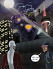
The Toronto X-Men are running a comic book cover contest. Whoever creates the best comic book cover using either traditional or digital art of your own wins. The voting will be done by the Toronto X-Men. The contest is for a "Marvel Prize Pack" which hasn't been described as anything other than that. The cover has to be X-Men related of course. This is my entry. I wanted to do a full Alpha Flight cover, but since they had their own title, I guess they'd technically be Alpha Flight and not X-Men related so I stuck with more X-Men while still including Guardian. This is easily the biggest thing I have ever drawn. I normally shy away from more than one character, technical things like robots and buildings and backgrounds in general, but pushed myself to do multiple buildings, the CN tower, a sentinel and multiple characters. What do you guys think? It's kind of rough in a lot of places, but I'm really proud of it, especially for colours and scale. The Sentinel was the weakest part of my drawing until the colours and editing happened and now it's probably the best thing on the page.
Anyway, the Toronto X-Men are a group of cosplayers who run regular events for multiple charities while in costumes. I've linked their facebook page at the start of this post.
That's pretty cool.
Have you considered using instruments - say a French curve or an ellipse template - to get a smoother line on things like the Tower?
~ Le Messor
"All those who believe in psycho kinesis, raise my hand."

Ok here are some criticisms but sent by an admirer of your work so don't get all RPLASS RAGE please!
I think the picture lost the concept of foreground/background. The figures in front fail as foreground figures for facing away from the reader, and the background figure, Storm, fails for being too small. The central element is the Sentinel, but he's so far away and has no sense of threat to him.
To improve, make the Sentinel scarier, attacking, moving, threatening, with hands up about to blast. Storm much bigger. Guardian and Cyclops a lot closer to the Sentinel and facing the reader. Make the foreground the characters and the background the Toronto skyline. If you're going to use a city skyline as a background, that's great but put in more buildings and more city. Finally, that mixed case text in Cyclops' speech bubble - change that to a hand drawn allcaps font or download a comic font and reprint it in all caps and with some ooomphasis. Refer to UXM #109 how JB put a speech bubble on the front cover of a comic and use that technique. Oh and add in more Alpha Flight members.
Please take this as constructive criticism, but I agree with Rob. I'd also look at Alpha #43 - don't copy it, but be inspired by it - for ideas of how to get characters as big as Sentinels to interact with characters the size of, say, Northstar.
I might look at putting a more suspenseful speech bubble on the cover. The one you've got reminds me of AF (original series) #1, and that's cool - but that probably won't work on the Toronto X-Men. Try something that makes the heroes look like they're in danger.
Please note: we're being critical (again, constructively, I hope) because this is for a competition, and:
We want you to WIN!
Also, more Alphans!
~ Le Messor
"Experience is something you don't get until just after you need it."
Thank you! Thank you! I'm an artist, I can take constructive criticism and even some advice and I thank you for all of it.
Some things are meant to be how they are, like the Sentinel not being scary. It's supposed to look like he's calling for help or is just dying slowly and pathetically. The sad expression and the out stretched arm indicates that for me and is further emphasized by the foregrounds characters lack or worrying and Cyclops saying that Storm's got it. The buildings? I used a ruler on the straight edges and fudged the perspective a bit. I'm new to drawing buildings and structures in general. I am more of a character kind of guy. Lately, I've decided to kick my own ass into doing bigger, better things and this is the result. This is the baby, the first steps to getting better. I am taking on buildings, large characters and multiple characters in one scene. The perspective on the lit up building on the left is off. The lights don't follow it correctly, instead they keep to the same view all of the way down the building and I know that when I drew it. Something to work on for next time. Hopefully there won't be a dead line. Another issue I know exists is that building in between Cyclops, Guardian and the sentinel. I didn't add windows so it just kind of looks awkward. Next time, I'll remove anything like that and clear a line of sight and see how that works.
Honestly, I don't think I'll win because there are a few people who actually go to school for this stuff who are entering but it isn't about winning for me, it's about having an excuse to push myself a little more. Thanks for the advice guys.
The instruments were more for the saucer section.
Why in particular were you going for a vulnerable Sentinel idea? Sounds like a cool idea.
~ Le M
"Half the people you know are below average."
You always see them looking either terrifying or destroyed. I wanted to go for something a little funnier. The tone was supposed to be kind of light. You have a giant sentinel that is normally scary and it looks like Storm is just toying with it and both Guardian and Cyclops don't seem to care that it's there by their calm poses and Cyclops' dialogue.
P.S. Florence, my girlfriend, won the contestBy the looks of the other covers, I'd be in at second but maybe that's just me. That Wolverine one is an awesome drawing (better than mine even) but not very cover like in my opinion. Here's a link to the covers that were submitted. Florences is the X-Men in a band. Clicky!
Anyway, thank you all for the feedback and let me know which covers you would have voted for and in what order. BE HONEST!
I could see the Wolverine one as a cover. It's not to my taste, but it's well done.
I'd vote:
X-Babies
Wolverine
yours and Florence's are about even
and the Gt-Size X-Men #1 tribute last. (I'm not counting B&W vs colour as two different covers.)
The trouble I'm having is, yours and Florence's are more to my taste than the Wolverine, but not as well-done. Makes it hard to decide. I gave it to the slightly better skill, though - which you yourself admit to.
I only looked at the thumbnails.
~ Le Messor
"If at first you don't succeed, skydiving is not for you."
Deadpool shreds! \m/ - lol. Anything with Deadpool on lead guitar has my vote!
I'd agree with you, GB; based on those artistic works, I would definitely put your Vulnerable Sentinel in 2nd place.
Support Artists, Not Companies! Creator-owned comics are where the real art is at!
My new website! http://lifelessordinarywebnovel.com/home.html Follow my super-powered web-novel adventures, "Life Less Ordinary"!
Twitter (1) = @RealWyldeChild
Twitter (2) = @lifewebnovel
FaceBook = https://www.facebook.com/realwylde.child or search for me at " Life Less-Ordinary "
Also 'occasionally' ranting Alpha Flight related stuff at http://canadas-own-the-flight.blogspot.com/
I would vote:
1st place: the one with Guardian
2nd place: artistic Wolverine pose
3rd place: everything else

 Reply With Quote


