Yep I still dislike this designOriginally Posted by -K-M-


Yep I still dislike this design
I'd vote for Boch's original blue design. The red one that followed was nice too, only really the colour was different, but I htought it was TOO patriotic to have it red, preferred the blue.
Support Artists, Not Companies! Creator-owned comics are where the real art is at!
My new website! http://lifelessordinarywebnovel.com/home.html Follow my super-powered web-novel adventures, "Life Less Ordinary"!
Twitter (1) = @RealWyldeChild
Twitter (2) = @lifewebnovel
FaceBook = https://www.facebook.com/realwylde.child or search for me at " Life Less-Ordinary "
Also 'occasionally' ranting Alpha Flight related stuff at http://canadas-own-the-flight.blogspot.com/


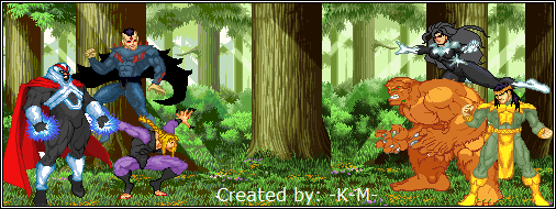
It has to be the original Box, before the Madison upgrades to his suit...Having him control it via helmet was a different touch, I loved it.

100% in agreement with the above poster. The original blue was the "bomb diggity" as some fly youngsters might say.


thats the worst box ever!
So I replied Jefferies, great look. However for some reason Bochs, was smart ass enough to, actually stole some scenes. Hoping to see more of the "team play"that made the original series flourished.
 Posting Permissions

 Reply With Quote